
Movie poster colour palette

Earlier today Empire Magazine tweeted an update announcing the release of the latest movie poster for The Woman in Black, an upcoming film adaptation of the book of the same name, starring Harry Potter star, Daniel Radcliffe.
Intrigued to see the new poster I went and had a look and sent a slight knee-jerky response comparing it with the last Harry Potter film poster as their colour palettes we strikingly similar:
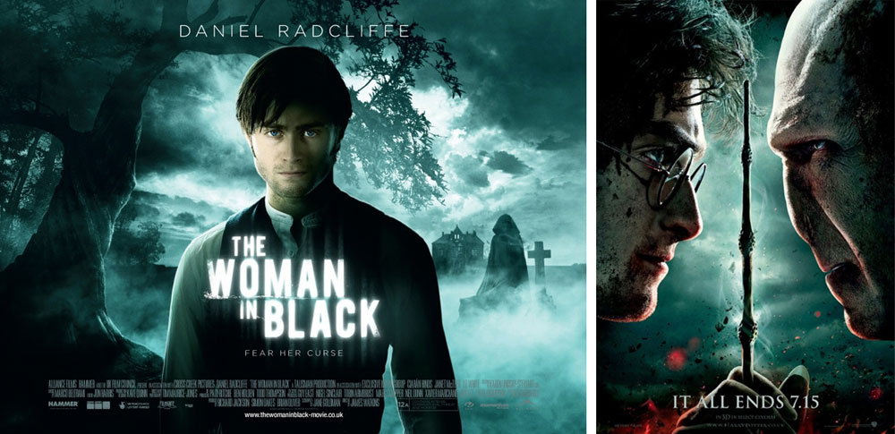
Don't get me wrong, I like the poster but I just think with it being a Daniel Radcliffe film, I thought the filmmakers would have gone for something that stood out on its own. After posting, I got a response from a gent whose opinion was that it wouldn't look right any other way. It's a fair opinion but having seen various other marketing materials for the film using a more monochromatic and desaturated colour palette I began to wonder if it was selected deliberately to try connect the films.
I decided to run a couple of (very) quick trials by putting the poster through Photoshop and create a couple of variations just to see what it looks like.
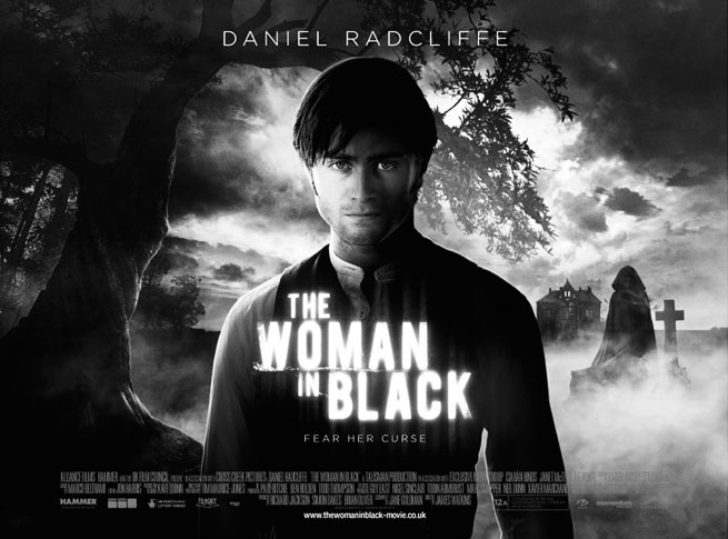
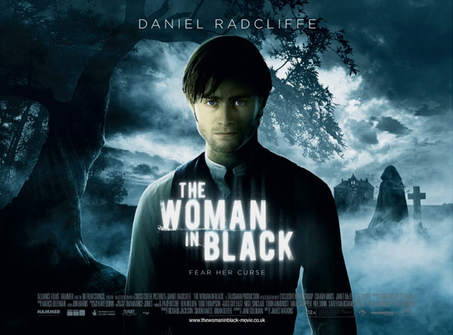
Personally, I think the colour alternative looks quite nice but it still wouldn't tie in with what's come before it but I'm still not convinced the green palette is the best option. What do you lot think? Catch me on Twitter, I'd love to hear what you think.