Beorn colour test

Back in October '22, I was scrolling through Twitter when an artist I follow posted that he was looking for a colourist:
Alright, Monday morning folks!
— Ben Bender (@BenABender) October 31, 2022
I'm looking for a colorist for Beorn! If you, or anyone you know, might be interested, please DM me with details (samples, page rates). For now, I'd like to keep close to the aesthetic I already have going.
Thanks so much!
(Page included for fun) pic.twitter.com/OwqRftYecr
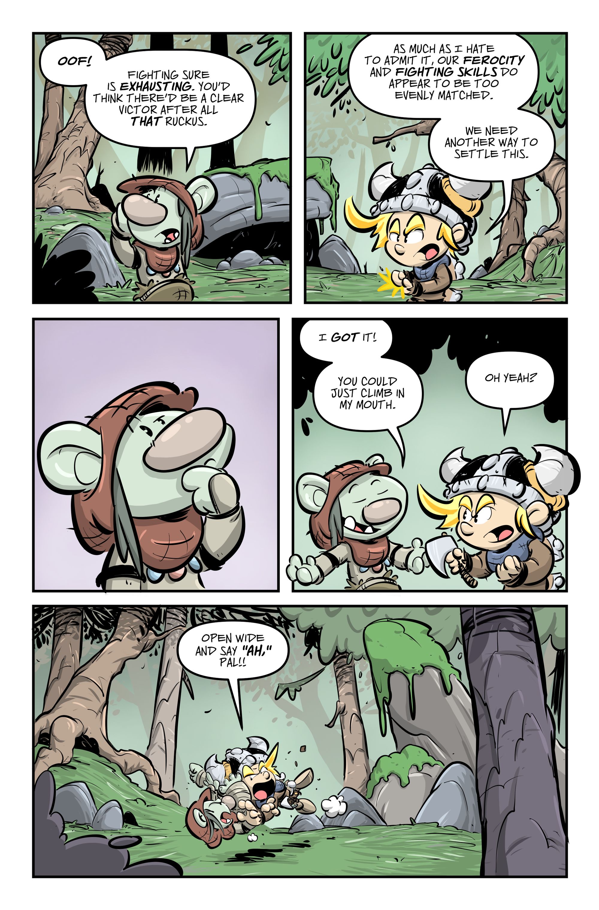
I reached out explaining I wasn't an experienced colourist but I love Ben's Beorn comic would love to have a go at doing a test page. To my surprise, he was really supportive of any skill level trying out and sent over the blank page along with his finished version above to use as reference. The brief was to colour the page from start to finish and try mimic Ben's style of colouring.
I set to work.
Colour flats
Colour flatting is a bit of a tedious part of the process for me. It's the act of chopping up the artwork into different sections using block colours. These colours don't always necessarily need to match where they end up, it's main purpose is to have sections of the artwork more easily selectable later in the process, without the need for constantly having to colour around different shapes in the artwork.
Applying the colour layer
Once the flatting process is complete, it's then onto applying the actual colours. I had Ben's original colour reference to hand for general guidance but I deliberately didn't use any colour swatching from the reference, except the base colours of the characters themselves. I figured they absolutely needed to right but the environment was a little more open to interpretation.
I'm still figuring out this process for myself. Some people will apply their colouring and then apply lighting effects and shadows afterwards on separate layers. For this page, I decided to attack each section in an "all-in-one" process. I'd isolate a section, say a tree, lay down the final base colour then just went straight ahead with applying any highlights or shadows directly on the same layer. In most cases, it just allowed me to work quicker knowing once I felt like I'd finished one part, I didn't have to worry about it again. There's also the added benefit of seeing the "final" work taking shape as you go rather than it being a multi-stage process with layers and layers of other effects. Plus, it just keeps managing layers in Photoshop way easier to keep track of too.
After a few evenings spread over the course of a week, I finished my version. Looking back on it now with fresh eyes, there are definite obvious differences and things I'd look to change if I were to go back and rework it. Ben's art has some textures applied, some additional lighting here and there and different treatments for things like the grass which I tried to make look more textured.
Having said that, I'm still pretty happy with the end result overall, considering I'm not a skilled colourist by any stretch.


I went into this mini-project fully aware of my limitations as a colourist. I'm not sure whether it's because I was working with someone else's art but I certainly felt a lot more freedom while working. Perhaps I'm looking at the artwork as more abstract shapes rather than casting a critical eye which I often do while working on my own art (eg "Those lines could be better").
Doing this and getting as far as I did gave me a little confidence boost for sure. Straight after this, I went into colouring a 3-page Barnacles comic which I'm pretty pleased with. So, even if I don't land the job as a colourist on Beorn, it's still been a valuable project for me to take on.
Bonus round!
I did try a version of my colour test with some simple god-ray lighting effects but I think it's too much. Thought I'd show it anyway, here are my colour tests side-by-side.