
O brother fan art process

Last week, I got a hankering to watch O Brother, Where Art Thou? and after I'd watched it, I got a hankering to draw some of the characters. As I did most of the work digitally, it was fairly easy for me to export the various steps as I went so I figured I'd post them up for anyone who is interested.
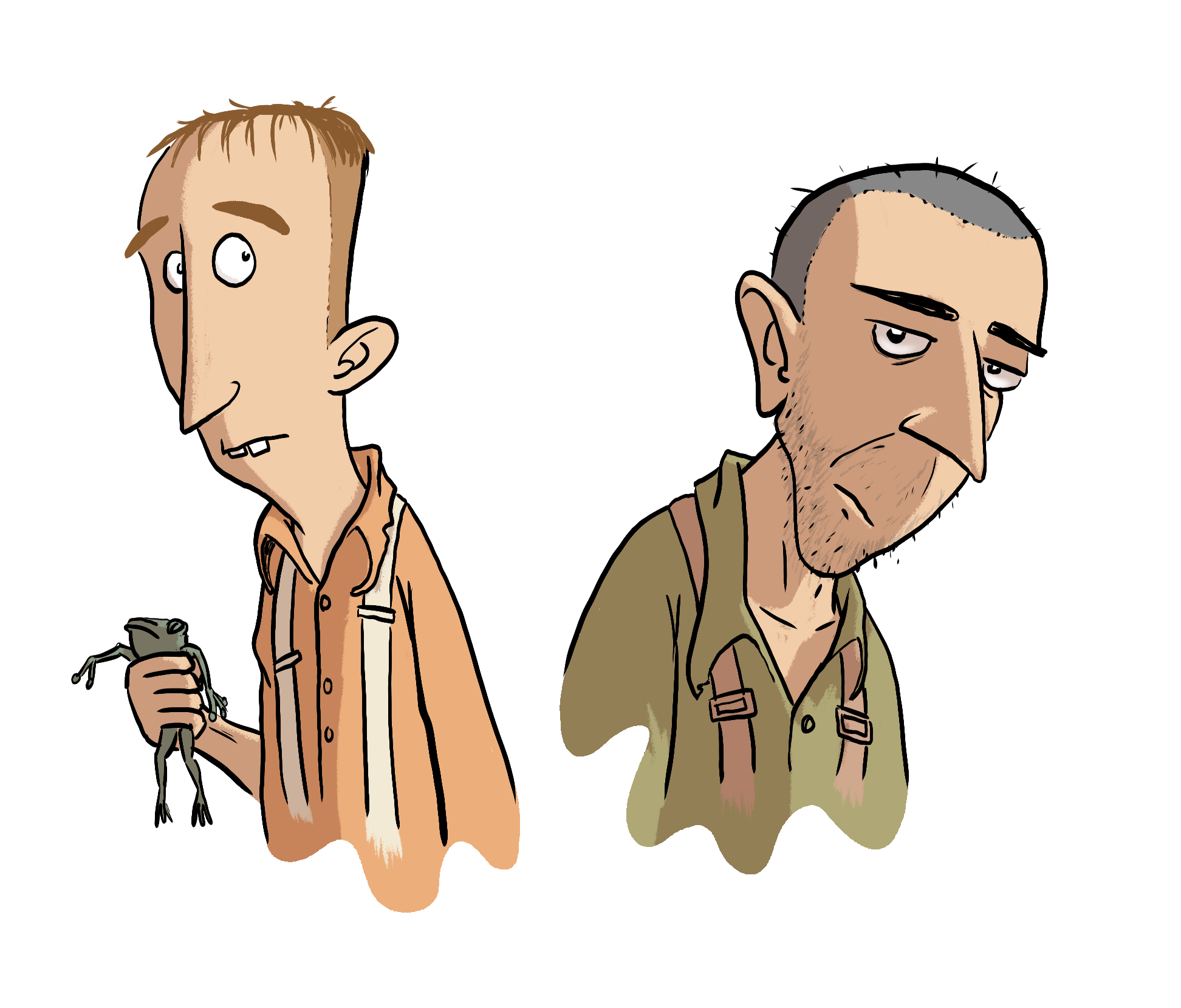
I plan to draw all three but George Clooney's character is proving elusive so far. This process covers off the drawings done so far of the characters Delmer and Pete, who have features more easily transferred to fan art (at least for this particular artist).
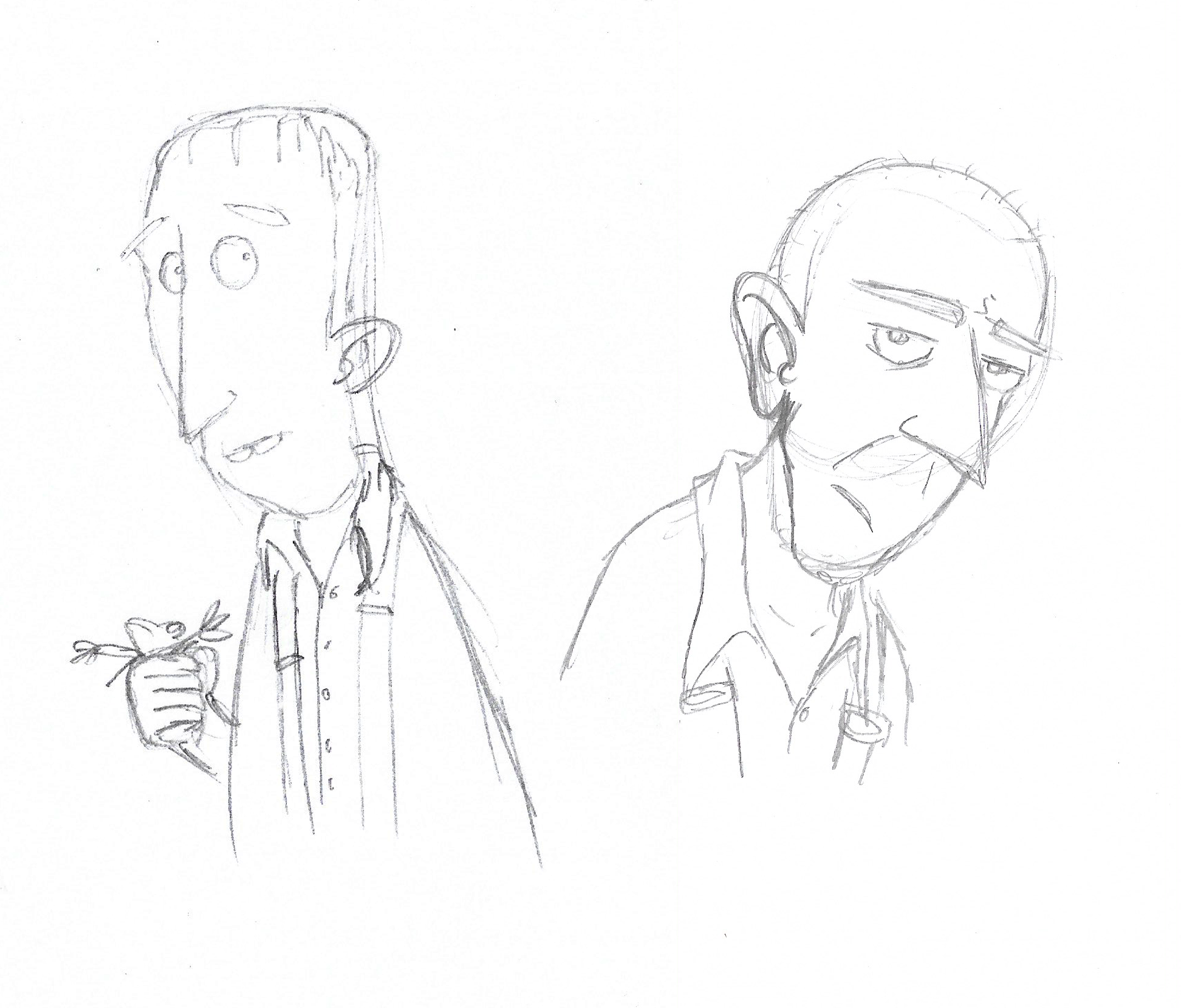
Pencils
I've not yet figured out my rough phase of working digitally yet so it's traditional paper and pencil until I do. At the moment, it still feels more natural working on paper to scribble ideas down in rough form.
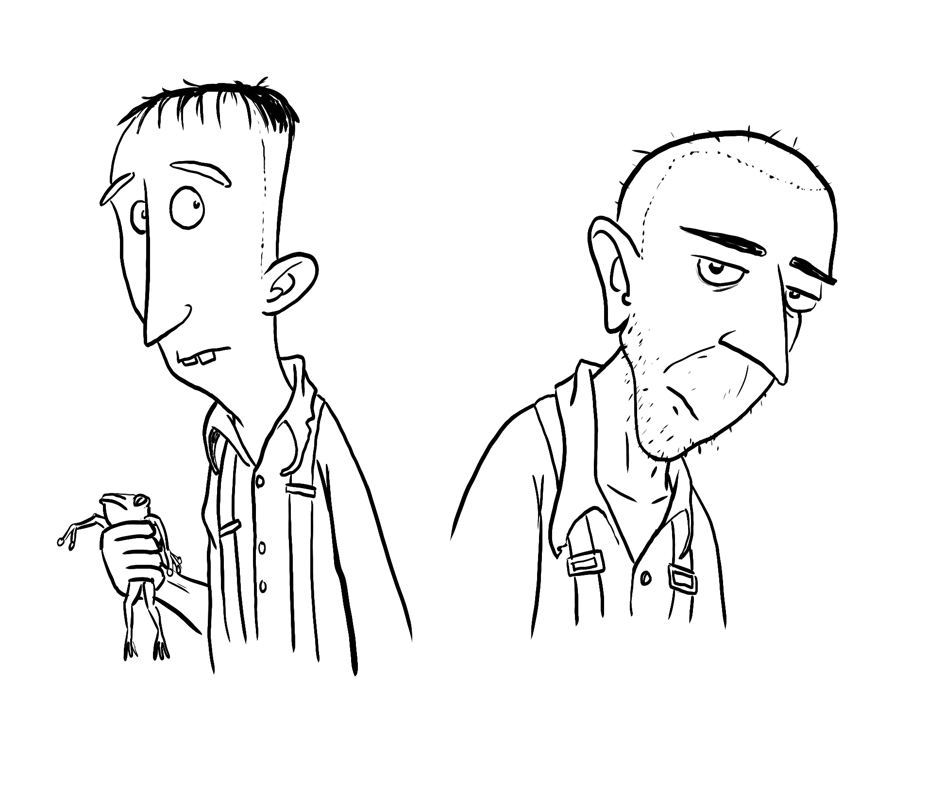
Inks
From this point, everything is done digitally. Over the last few months, I've tried a few Photoshop brushes for inking to try get as close to traditional lines as possible. The search may still continue over time but for now I've found one of the default brushes, KYLE Ultimate Inking Thick 'n Thin, to give me a result I'm happy with. Aside from the choice of brush, everything else happens as it would with a brush pen. I can vary the line based on pressure applied on my pen display. I'm starting to very much see the benefits of a digital workflow. I'll write a separate post on that in future.
Flat colour
The next step is something I've only learned about in the last year. "Flatting" your art basically means dropping base colours on to the areas which you plan to colour. Some people choose any random colour for each section, which I've tried and found a hinderence more than a help when it comes to making colour choices. Instead I opt for the process of choosing base colours as close to the overall scheme you plan to run with for the final art. Again, there's more on this particular part of the process which could be a post of its own.
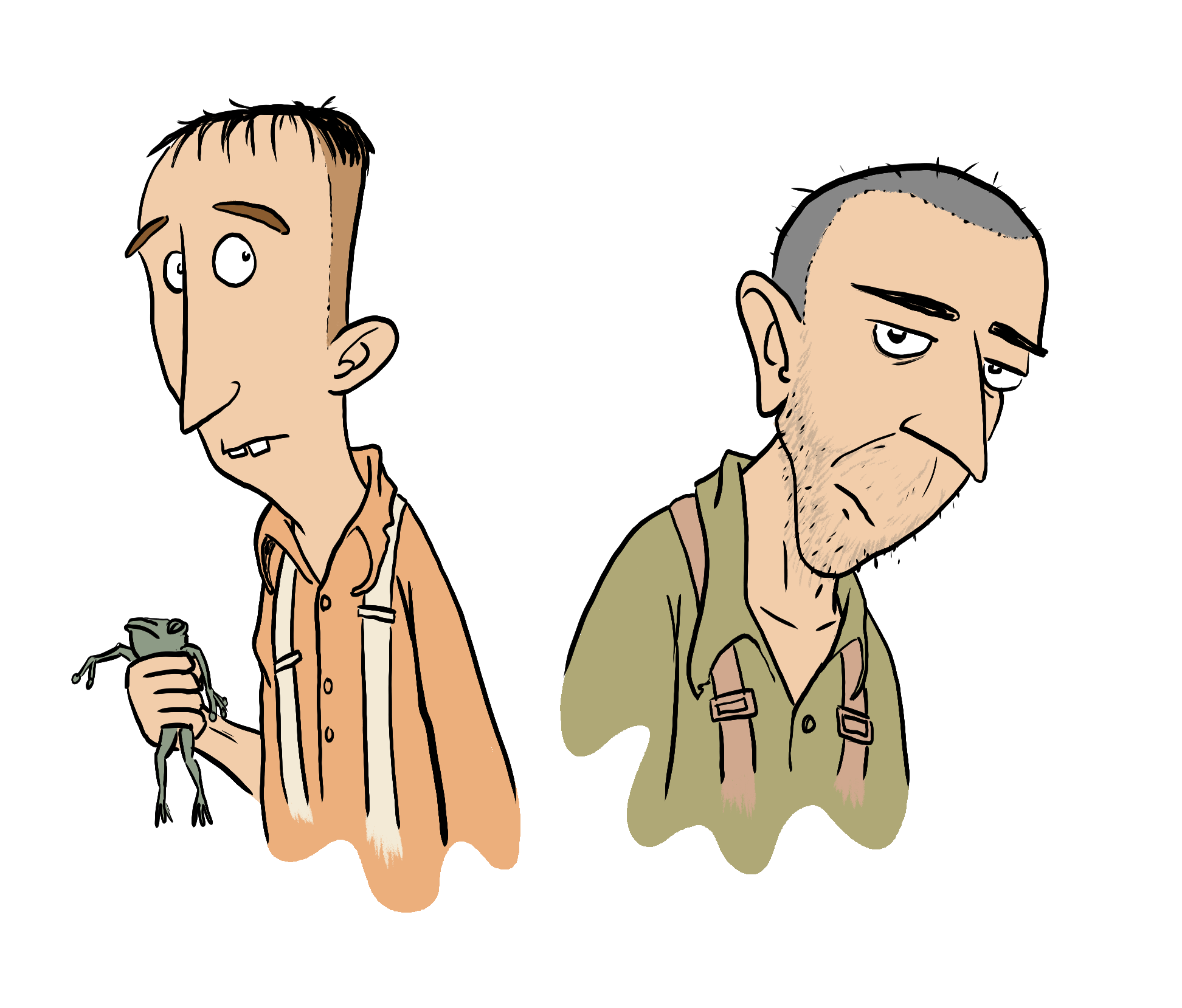
Tweak line art colour
This step is something you'll see a lot in comics or illustration, where line art itself is a different colour from the default black line. It can be used to help separate foreground and background among other things. In this case, I've just used it to change the colour of the hair of Delmer on the left.
Add shadows
Another tip I picked up this year was a quick way to add shadows. In the past, I'd simply sampled the base colour, made it a little darker and off I went. This is not only time consuming as you're having to make even more active colour choices and can also lead to shadows looking incohesive. It's an extensive topic in its own right so I'll not cover it here. My process here was to choose a brown-ish colour, set the mask layer to 'Multiply' blending mode and reduced the opacity to 45%. All that was left to do was paint in the colour and bam! Finished!
This is a fairly simple run down, and the drawing itself was just a bit of a wind-down doodle done at the end of the day. There's a lot more that could be done with this and other more experienced colourists would no doubt be able to come up lots of really great versions. If you want to have a play yourself, I'll happily share the PSD file on Dropbox, just ask on the socials.