Playing with the logo
I've been using the same logo in varying forms for about three or four years now but from time-to-time I start scribbling on a page to see if anything comes out of it.
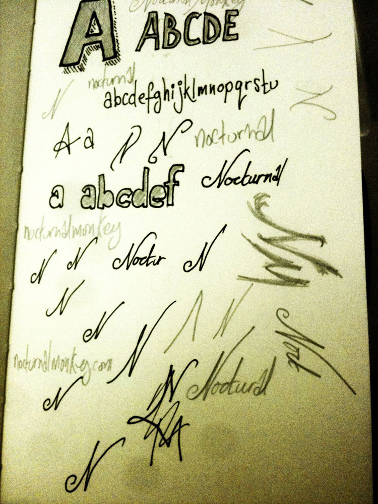
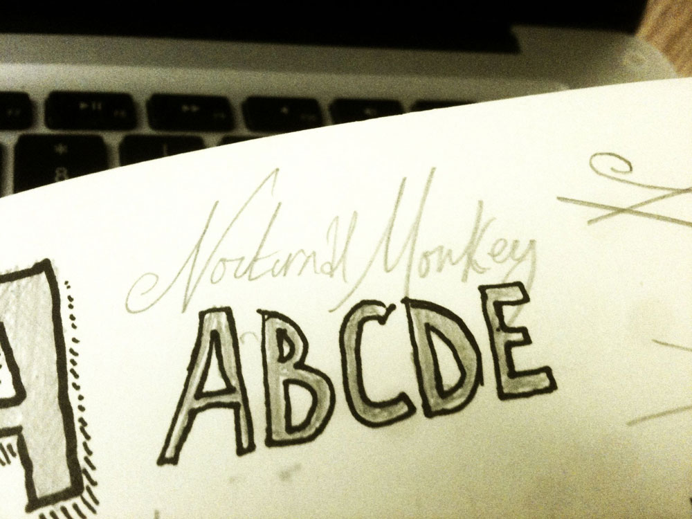
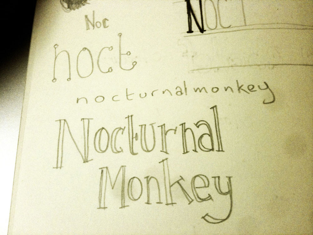
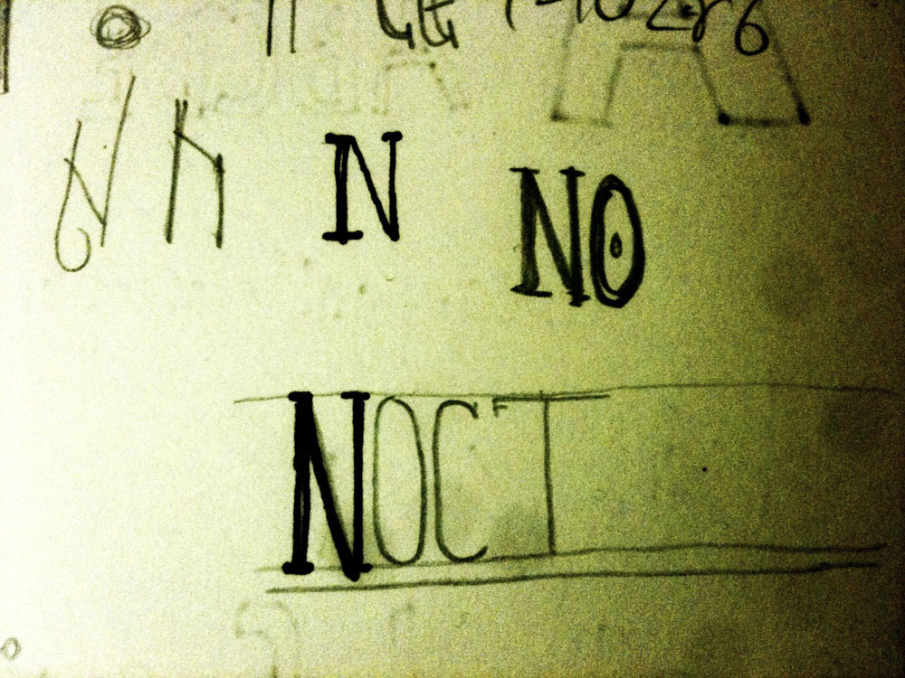
There is never really any intention to replace the existing logo, it's just an exercise to get the pen moving without really thinking about it. Below are some shots from a recent bout of sketching.
They are all exploring the logo without the aid of an icon as I've not really taken to any previous icon designs I've done for my blog.

The page above is primarily my exploration of a sweeping uppercase n but also features a few explorations into creating some handwritten typefaces but none of which I like.

This handwritten version is similar to what I have at the moment which left me wondering whether I should explore this further.

Just a couple more variations but not really keen on any of them, same goes for below.

I think I'll explore the idea of creating my own handcrafted version of the existing logo (without trying to mimic the typeface) and report back some other time. Should I stick with what I've got? Should I not concentrate on the logo at all? Do I even need a logo? I'd love to hear your thoughts.

