Sainsbury's missing a trick?
This morning I went to my local Sainsbury's to pick up a few ingredients for a birthday meal I'm cooking for Luisa. I wandered around with my shopping list and picked up what I could find. After my shopping trip, whilst eating my breakfast I decided to look up the remaining items on their website to see if they stocked what I needed and also to get an idea of what kind of packaging I need to look for when I nipped back later on.
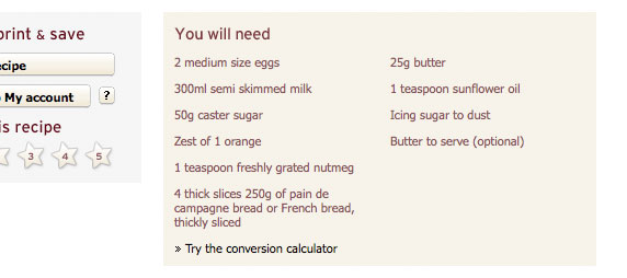
Once I'd finished searching, I decided to browse the site for a short while and ended up looking at a few recipes and this is where I think Sainsbury's are missing a huge sales opportunity. A recipe page on their site is fairly typical of recipe pages on the web. There's a nice photo of the finished meal, cooking method, rating system and of course a list of ingredients...

Now you might not think there's anything wrong with it, which in reality there isn't, but from a customer point of view, what would they have to do if they wanted to order these ingredients? They would have to leave the page, search for each item individually and add them to their shopping list. With a small addition, the page could not only become more useful to the shopper but could help increase online sales.

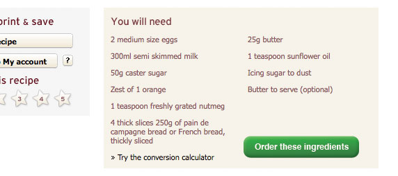
In the rough example above, I've added a button (and made it very obvious for the purpose of this example) which allows the shopper to order all the ingredients they'll need for the recipe in one click. After clicking, they'd perhaps get a quick message saying it's been added to their basket and leave the shopper to continue browsing the recipe page until they are ready to check out.
Lots of variations of this idea could be applied, but if they allowed users to buy what they need with such little effort, I think they'd see a dramatic increase in sales.

