
The Guardian grid

I've been playing with the Guardian beta site for about a week now. I think it's a much better experience than the current site and the design feels a lot closer to the newspaper (well, what I remember of it, it's been a while since I read an actual newspaper).
I decided to spend a little bit of time trying to gain a better understanding of the grid used on the site. The following is really just a mind dump for my own benefit with no conclusions but if anyone out there wants to continue the discussion, you can catch me on Twitter.
Being able to successfully dissect a grid is a skill I want to get better at to further my understanding of designing grid systems so here are my initial thoughts...
The homepage
The layout of the homepage is fairly suggestive of the main grid comprised of 5 equal width columns with equal gutters.
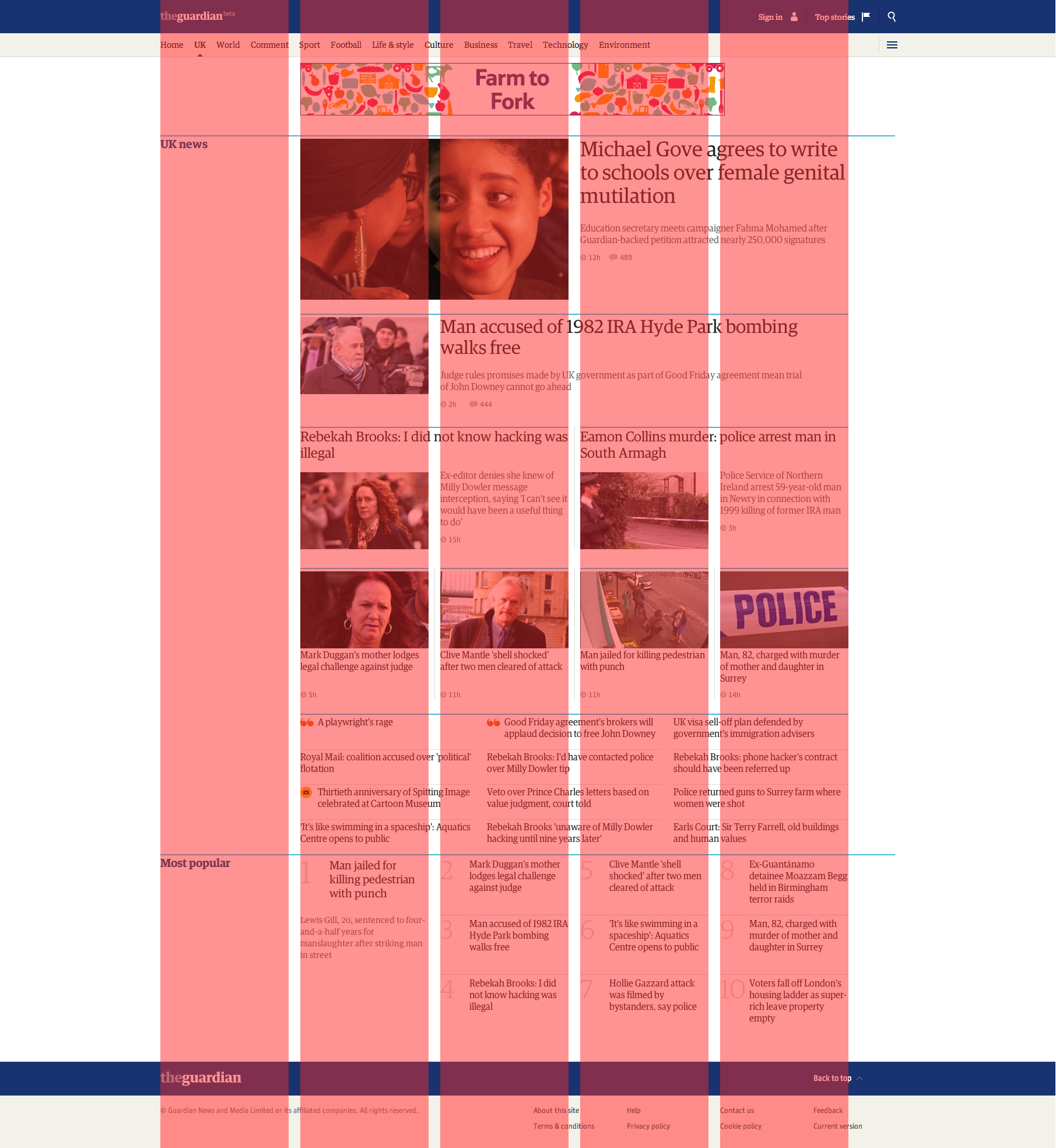
There is also another grid in place here which uses a single column from the 5 column grid and divides the content area into three columns (this also comes in to play with an article page).
The one thing I'm yet to understand is how the remaining space to the right of the content comes into play. Is this just a remainder or is there another element to this grid I'm yet to discover?
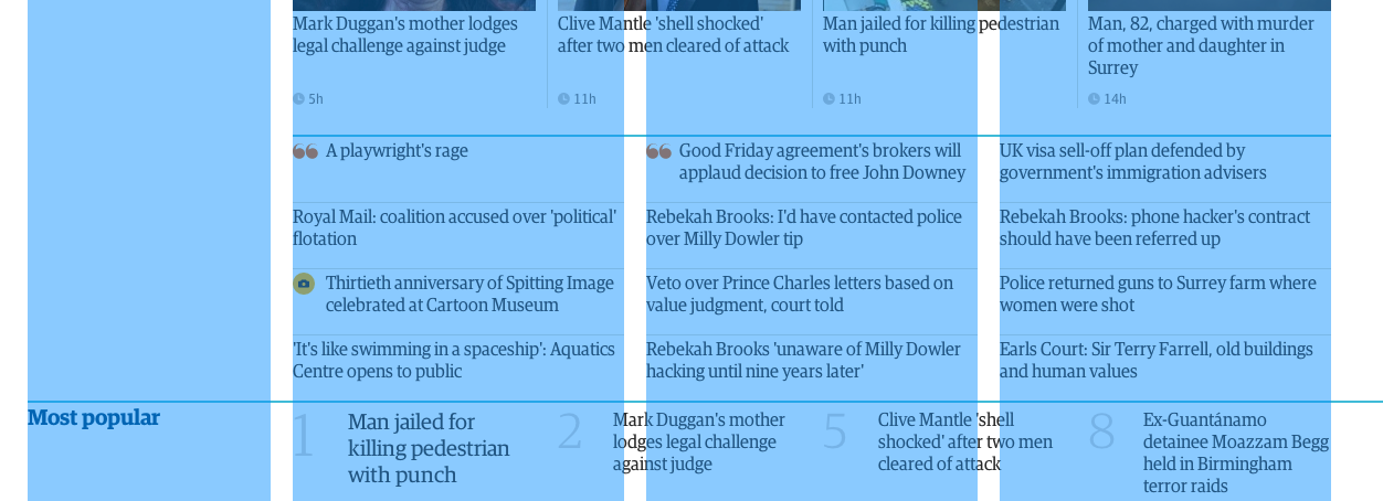
Article page
The article page uses the 4 column grid used in part on the homepage but the right-most column has a larger gutter between it and the article content. This is another element, like the homepage, which I've not managed to suss out just yet.

Again, this is really just written out for my own benefit, a spring board to delve deeper into figuring this out. My initial thoughts may not be acurate to the actual grid system in use. Any thoughts or insights would be welcome!