
Time for a change

A part of me is reflecting on the designs I've done for this site over the last seven or eight months and while I'm happy with the designs of some of the more recent articles (and have had some lovely feedback from many folks), there is something about the way I designed them that doesn't feel right.
I'm not much of a writer so ideas don't come to me as often as they do to others so when I do get a flash of inspiration, it's usually a dash to the finish before the idea goes stale. Quite often I feel the urge to write but can't think of an appropriate design so the idea fades away. One issue I have with how I've approached this whole "art directing" (sorry Colly) method is when I first set about doing it, my mind was so focused on creating fresh designs that I didn't really consider an appropriate "default layout for when I just wanted to share a thought or two. I've also not really given myself the leg room to consider use of alternate grid systems, typography etc, I lay out my design over a simple grid and hit publish. Here is where the change comes in...
Currently, the site sits on a simple 8-column grid which works fine except I always get the feeling that some elements are placed in a fairly adhoc way. I've also never really set out any guidelines for image scales, typography and I think it's about time I start putting into practice all the things I've learned over the years.
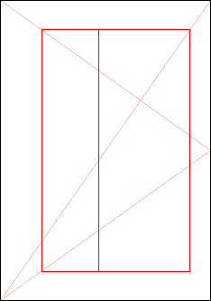
The new idea is simple, set out my default guidelines first then continue to create designs appropriate to the writing when the mood takes me. A recent brush with print design has breathed new air into grids for me and I hope to use this site to learn more about them. For me that learning starts with the Golden Ratio.
I intend to look at each new article is if it were to be printed on a single sheet of A4 paper providing me with fixed dimensions, both horizontal and vertical, to play with layout. I know some people may think me crazy for sticking to fixed measures as one of the great things about the web is the ability expand and to not have the constraints of print design. In my case however, I wish to apply these constraints to gain a better understanding of grid layout and work within a fixed amount of space.
I've read many design books which discuss grids and typography but most are print related so I've never really felt I could apply what I've learned. By doing this I hope to create better, more considered designs using words and imagery that share a relationship on the page.
In closing...
This isn't me preparing to wave goodbye to kitting articles out with their own design, in a weird way, I'm placing boundaries and constraints to free myself. With a default in place I can get back to what writing is all about and pull a fresh design out of my hat every so often as a sugary treat.