
Don't get ahead of yourself...

Progress on my comic has been slow. General day-to-day life takes it out of me a lot and generally by the time I get a chance to do some work, around 8 or 9pm each night, I'm knackered and just ready to shut off and rest. Couple that with the stage at which I'm at, something I don't feel particularly comfortable doing: colouring.
For some reason, I've always struggled with colour. Getting combinations which look right and finding the right brushes in Photoshop to get the effect I want has always been something that doesn't come particularly naturally to me. It's the main reason why you don't see a great deal of colour in my Instagram feed. It's mostly black and white work.
I could put out my comic as just black and white, it'd save on print costs, but it's not what I envisioned so despite not enjoying this part of the process, I'm forcing myself to get on with it.
Last week, I was getting fed up with doing colour flatting so decided to dive in and start colouring page one and after a few false starts, I got into a bit of a groove and managed to arrive at something I was please with.
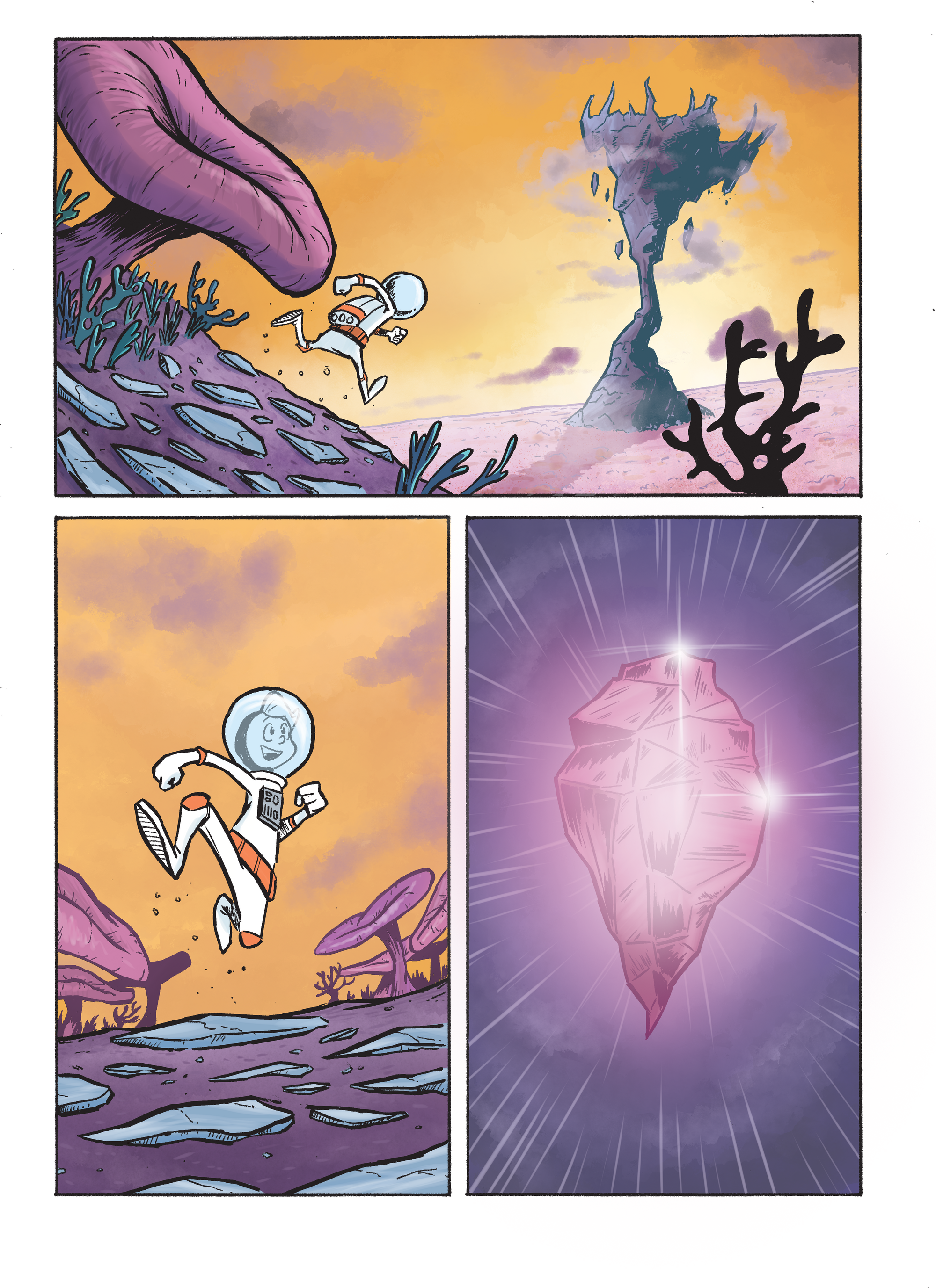
After a bit of experimenting, I've found a few brushes in Photoshop which gives the slightly textured effect I was looking for on the backgrounds. My aim is for an effect you see often in animation where the background might have more texture and effects applied and the characters have a slightly simpler, flatter style with more sharper edges on shadows. The character on this page is pretty simple in it's colour scheme so it's hard to really judge how successful this approach will be until I'm a few more pages in.
While I'm happy with the end result so far, I'm trying to not play down the fact I have a long way to go and I need to pick up the pace. I want this book to be on it's way to the printer by November so I need to be averaging 3 pages a week, if not more from this point. I'm still looking up at the mountain ahead...